
A spreadsheet overflowing with numbers can seem like an insurmountable wall. There is only one solution for transforming that raw data into a clear and compelling story: learn how to create a chart in Excel. When used correctly, this tool allows you to visualize trends, compare results, and communicate complex ideas at a glance, making your analyses accessible to the entire team.
This guide will take you step by step, from the basics of data preparation to understanding when it's time to move on to more powerful tools. You'll learn not only how to do it, but why to choose one type of chart over another, transforming your tables into powerful decision-making tools.
Data alone doesn't tell you much. To make strategic decisions, you need to interpret it, identify trends, and communicate the results in a way that everyone can understand. That's where charts come in.
A well-constructed chart is much more than just a colorful image. It is a powerful analysis and communication tool that can:
Whether you're a manager presenting quarterly results or an analyst hunting for a hidden anomaly, mastering chart creation is a critical skill in today's business world.
In this comprehensive guide, we will take you step by step through the world of data visualization with Excel. We will start with the basics, show you how to create and customize your visualizations, and finally, be transparent about the limitations of this tool. You will discover when the complexity of your data requires a switch to a data analytics platform such as Electe, which can automate the entire process and provide you with predictive insights, transforming your data into a competitive advantage.
A successful chart begins long before you click "Insert." The real secret, the one that makes the difference between a clear visualization and an illegible mess, is data preparation. If the source information is messy or poorly structured, the result will inevitably be confusing.
The first step in learning how to create a professional chart in Excel is therefore to organize your data.
Ensure that each column has a clear header and that there are no empty cells in your range. This simple table structure is essential: it is how Excel understands the relationships between the different variables you want to represent. If you often work with complex data, you may find it useful to learn more about managing CSV files in Excel, a very common format when importing data from other systems.
Once the data is clean and ready, it's time to select it. You can do this in the traditional way, by clicking on the first cell and dragging the mouse, or you can select only the columns or rows you need by holding down the Ctrl key while clicking. This is a very handy shortcut for isolating only the relevant information.
However, choosing a chart is never just a matter of aesthetics. It must answer a specific question. Always ask yourself, "What do I want to communicate with this data?"
The golden rule is clarity. If a pie chart has more than 5 or 6 "slices," it becomes an unreadable mess. In such cases, a horizontal bar chart is almost always a better choice, because it allows our eyes to compare lengths much more easily.
For these preliminary analyses, Excel remains an irreplaceable tool in many companies. It is estimated that around 80% of Italian SMEs use it for its immediacy in creating basic reports.
However, when data becomes more complex and updates are continuous, manual entry can become a minefield of errors, risking compromising business decisions based on those numbers. This limitation is clearly evident in various analyses of Excel use in SMEs.
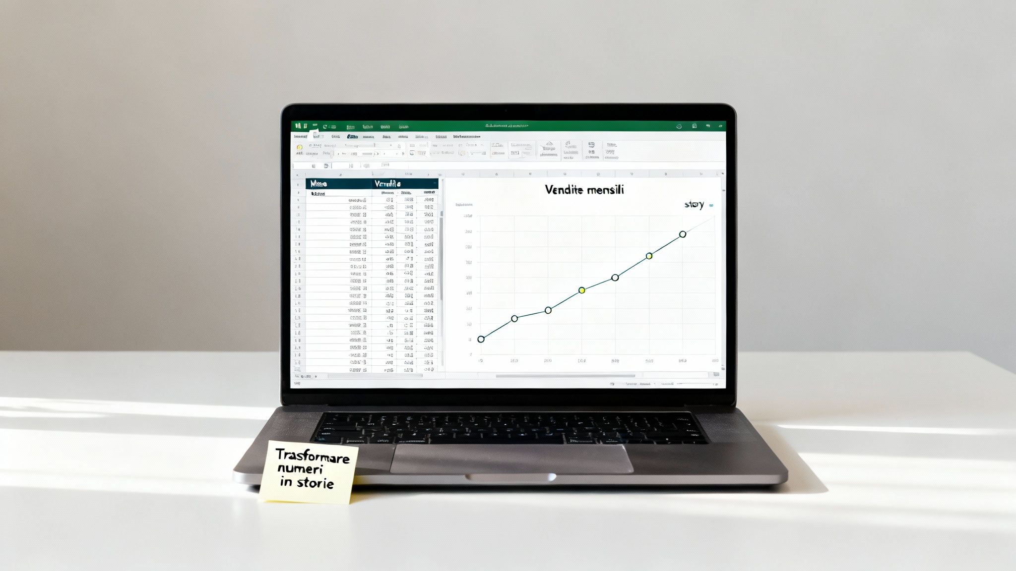
Okay, the data is ready and well organized. Now it's time to put it into practice, and I assure you, creating your first chart is much easier than it might seem. To make it more concrete, let's imagine we have a set of data that tracks the monthly sales of a new product.
The basic procedure is very intuitive. First, you need to select the range of cells containing your data, including the row and column headers (in our case, "Month" and "Sales"). This step is crucial: it tells Excel what information to correlate.
Once you have selected everything, go to the Insert tab in the top bar. There you will find the "Charts" section. Excel has a very useful feature called Recommended Charts, which analyzes your data and suggests the most suitable types of visualization. For beginners, this is the perfect starting point.
For our example on monthly sales, a column or line chart would be ideal. If you want to proceed manually, simply click on the column chart icon and choose the first 2D template. In an instant, Excel will create the chart directly on your worksheet.
This image perfectly sums up the workflow: organize, select, and choose.
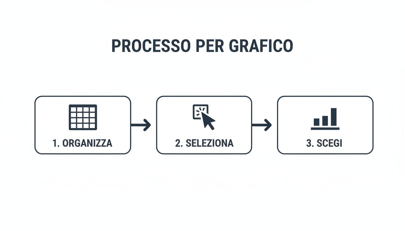
By following these three simple steps, you can get a basic visualization in a matter of seconds.
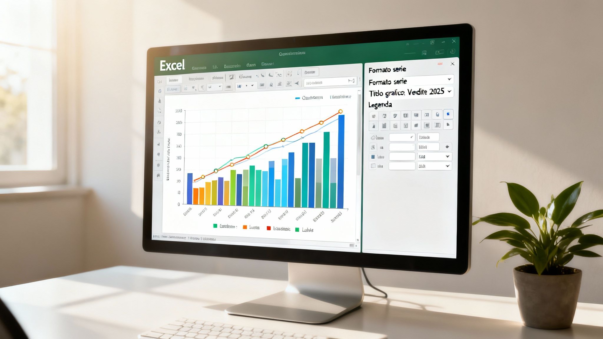
Now the chart exists, but it is still a little rough around the edges. You will immediately notice that two new context-sensitive tabs have appeared in the ribbon: Chart Design and Format. This is where the real magic begins: customization.
The first chart doesn't have to be perfect, but functional. The goal is to transform numbers into something visual. The aesthetic finishing touches and details will come later, as we'll see shortly.
The Graphic Design tab is your control center. From here, you can do just about anything:
Take a few minutes to experiment with these options. You'll quickly become familiar with the interface and be able to turn a simple table into a clear, professional-looking visualization in no time.
A standard chart gives you the bare facts. A custom chart, on the other hand, captures attention and tells a story. Once you have your foundation, the real work begins: refining, perfecting, and transforming the data into a powerful message. It's not just a matter of aesthetics, but a way to make everything more readable and highlight the key information you want to communicate.
With a few targeted adjustments, a generic visualization can become an effective communication tool, perfectly aligned with your brand. Fortunately, Excel gives us almost total control over every single aspect of the chart.
The first step in making a truly effective chart is to work on its main components. When you select the chart, you will see the Chart Design and Format tabs appear at the top: these are your command centers.
Here are some quick fixes that make an immediate difference:
For analysis that goes beyond simple visualization, Excel provides tools that add essential context. One of the most useful features is undoubtedly the trend line. With just a couple of clicks, you can overlay your chart with a line that shows the general direction of the data, making trends obvious at a glance.
In more scientific or statistical contexts, error bars are another crucial element. They allow you to visualize the variability or uncertainty of a measurement, adding a level of depth and professional rigor to your analysis.
A chart should not only display data, it should guide interpretation. Every element added, from a well-placed label to a trend line, helps transform numbers into a clear and direct narrative.
To ensure consistency across your various business reports, there's a pro tip: save your customizations as a template. Once you've created your perfect chart, right-click and choose "Save as Template." The next time you need it, you can apply the same style with a single click, saving you a lot of time. If you want to make your workflow even more efficient, learn more about Excel templates and how to use them to your advantage.
Excel is an extraordinary tool, let's not beat around the bush. It has literally democratized data analysis and, even today, it is an invaluable ally for millions of professionals. Learning how to create a chart in Excel remains a fundamental skill. But, for a growing company, there always comes a breaking point.
It is a time when relying solely on spreadsheets ceases to be efficient and becomes, in effect, a risk.
When data volumes explode and sources multiply, manual updating becomes a bottleneck. A simple copy-paste error or an incorrect formula in a hidden cell is enough to base strategic decisions on distorted information. And the consequences can be serious. Not to mention the inherent fragility of complex Excel files: how many times has a colleague compromised hours of our work by changing one small thing?
How do you know when you've reached that point of no return? There are unmistakable signs, real warning bells that every manager should be able to recognize:
final_report_V2.xlsx?"This shift from static charts to AI-powered analysis tools is a crucial turning point. Modern platforms such as Electe were created precisely for this purpose: they connect directly to your data sources (even an Excel file or your company's ERP) to generate intelligent and predictive dashboards, helping you optimize promotions or speed up planning. If you want to learn more, we discuss this in detail in our guide to business intelligence software.
To understand the difference, let's take a concrete example. You need to analyze sales. In Excel, you will probably create a bar chart. Clear, clean, but static. It tells you what happened.
Now, the same analysis on an AI-powered data analytics platform. The dashboard is live and interactive. You can filter by region or product with a single click. But that's not all. In addition to viewing past sales, artificial intelligence shows you a forecast for the next quarter, perhaps highlighting products that are at risk of going out of stock.
It's no longer just a visualization. It becomes a real conversation with your data.
We have explored in detail how to transform raw data into effective visualizations. Here are the key points to remember in order to master the art of creating a chart in Excel and understand when to take the next step:
If you recognize yourself in the description of someone who spends more time preparing data than analyzing it, or if you feel that your spreadsheets have become a barrier to your company's growth, it's time to explore a more powerful solution. Electe designed for SMEs that want to make data-driven decisions without the complexity of enterprise solutions. Turn your data into a competitive advantage.

.svg)
.svg)
.svg)